Zendo
Zendo is a start-up, building home automation & security devices for Apple’s HomeKit platform.
The following images show a sample of my contribution to designing Zendo’s identity, packaging, photography, user experience, website, e-commerce, & iOS apps.

Branding
Custom watercolors were used in the branding to create a sense of movement and organic, human connection to the brand.
Logo designed by Darren Hoffman.
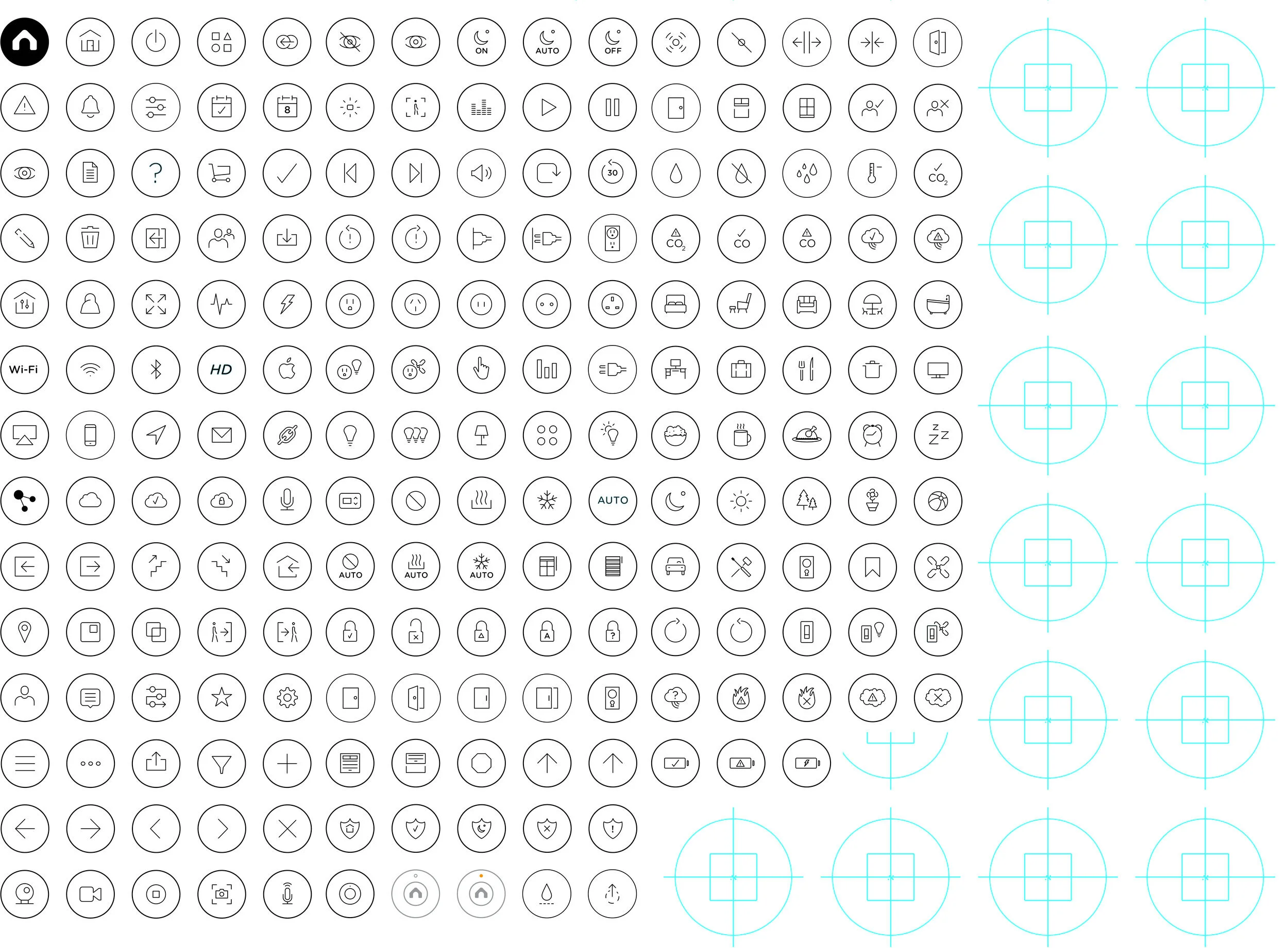
Over 200 custom icons were created for use in everything from marketing collateral to device control within the iOS apps.

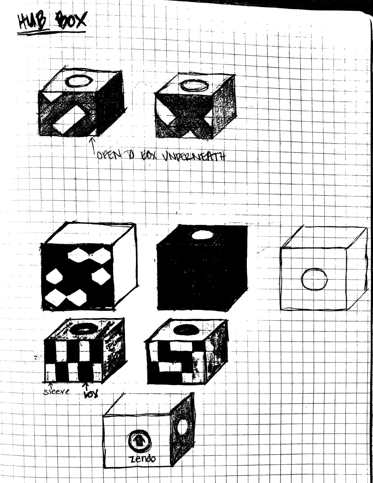
Packaging
Packaging was designed to be recyclable & reusable. The top loop doubles as a hang tag for store displays & detaches to become a bracelet for the customer.
Concept: Darren Hoffman & Lauren Britton. Final Design by Rachel Leake.


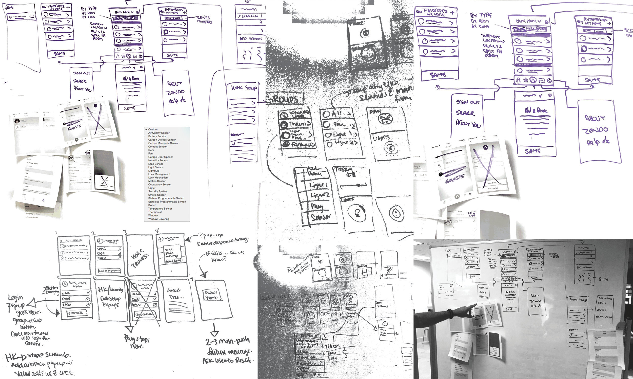
App Development & Design
The HomeKit SDK was under development when we began conceptual development for the app. Frequently changing requirements and functionality meant many rounds of whiteboard sketches with stakeholders, revisions, and user testing.
The HomeKit SDK was under development when we began conceptual development for the app. Frequently changing requirements and functionality meant many rounds of whiteboard sketches with all stakeholders.


The initial app concept revolved around a main dashboard for the home, and cards for each device. We quickly realized that HomeKit would rapidly grow, making the large cards cumbersome for people with many devices. People could also benefit from multiple locations.


The next version involved showing the devices on small cards and making the locations easily switchable, and devices sortable from the dashboard. Tapping the device icon allowed people to control their devices, while tapping the arrow took them to the device settings. People could also switch between the different sections of the app through the bottom tab bar. Testing and analysis revealed that the watercolor needed to be removed in the next version.
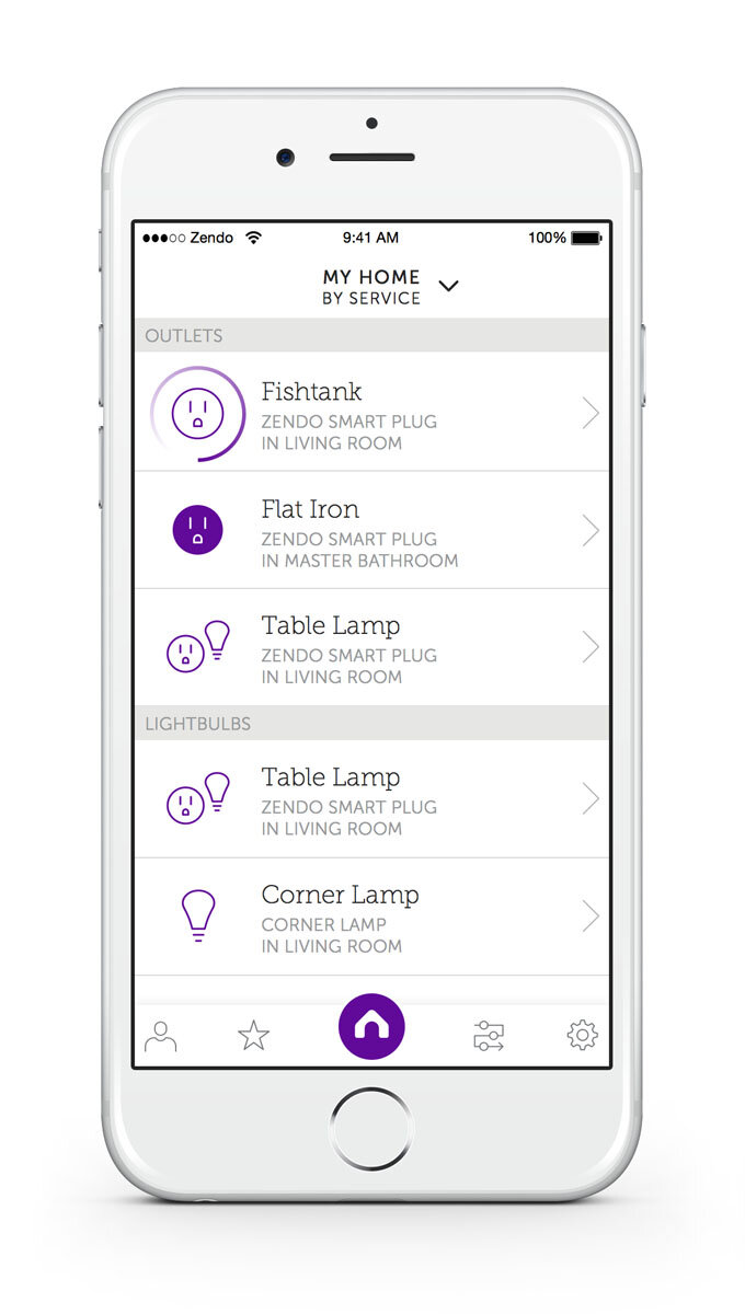

The final* app designs before launch.
*There’s no such thing.
The first iteration of onboarding used 3D touch, heavier animations, & a modal to add new locations. After testing, we decided to refine the animation and remove the modal from the experience.
Credit: Iván Corchado Ruiz, Developer.
The watercolor background was removed from the final version of onboarding as well to match the rest of the app.
Credit: Iván Corchado Ruiz, Developer.
This animation plays when a scene runs. The length of time it takes for a scene to run varies depending on the number of devices being controlled, so this animation helps verify that the scene was completed.
Credit: Iván Corchado Ruiz, Developer.

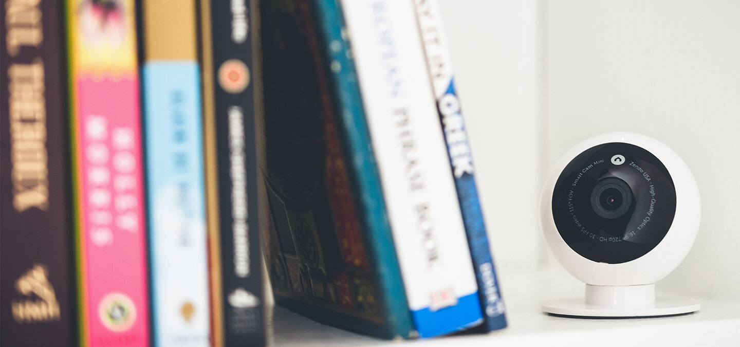
Photography
The creative team decided to use my photo skills by staging a guerrilla photo shoot for our launch images.


E-Commerce
The e-commerce site was a collaborative effort between Zendo & Electric Pulp.
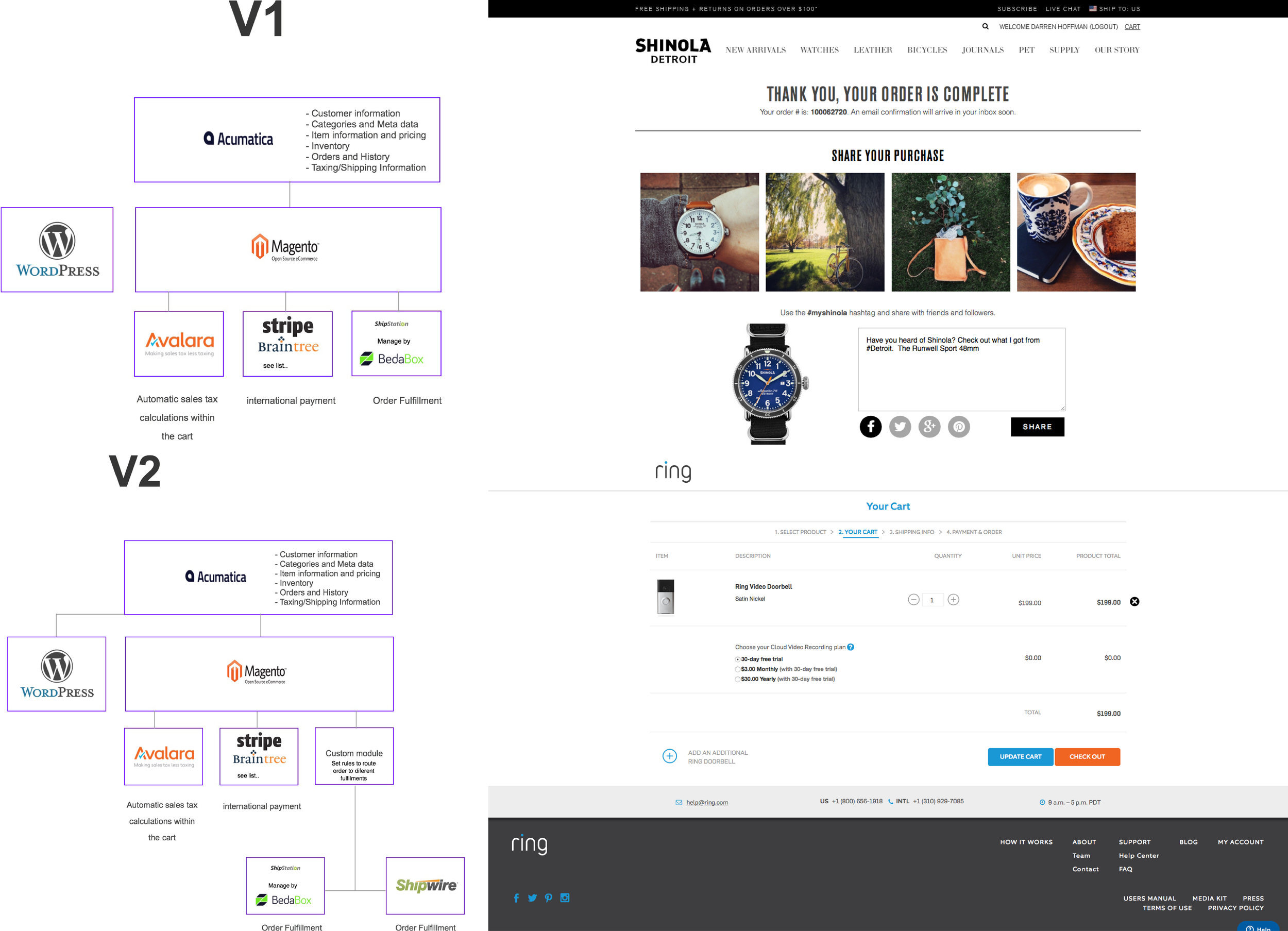


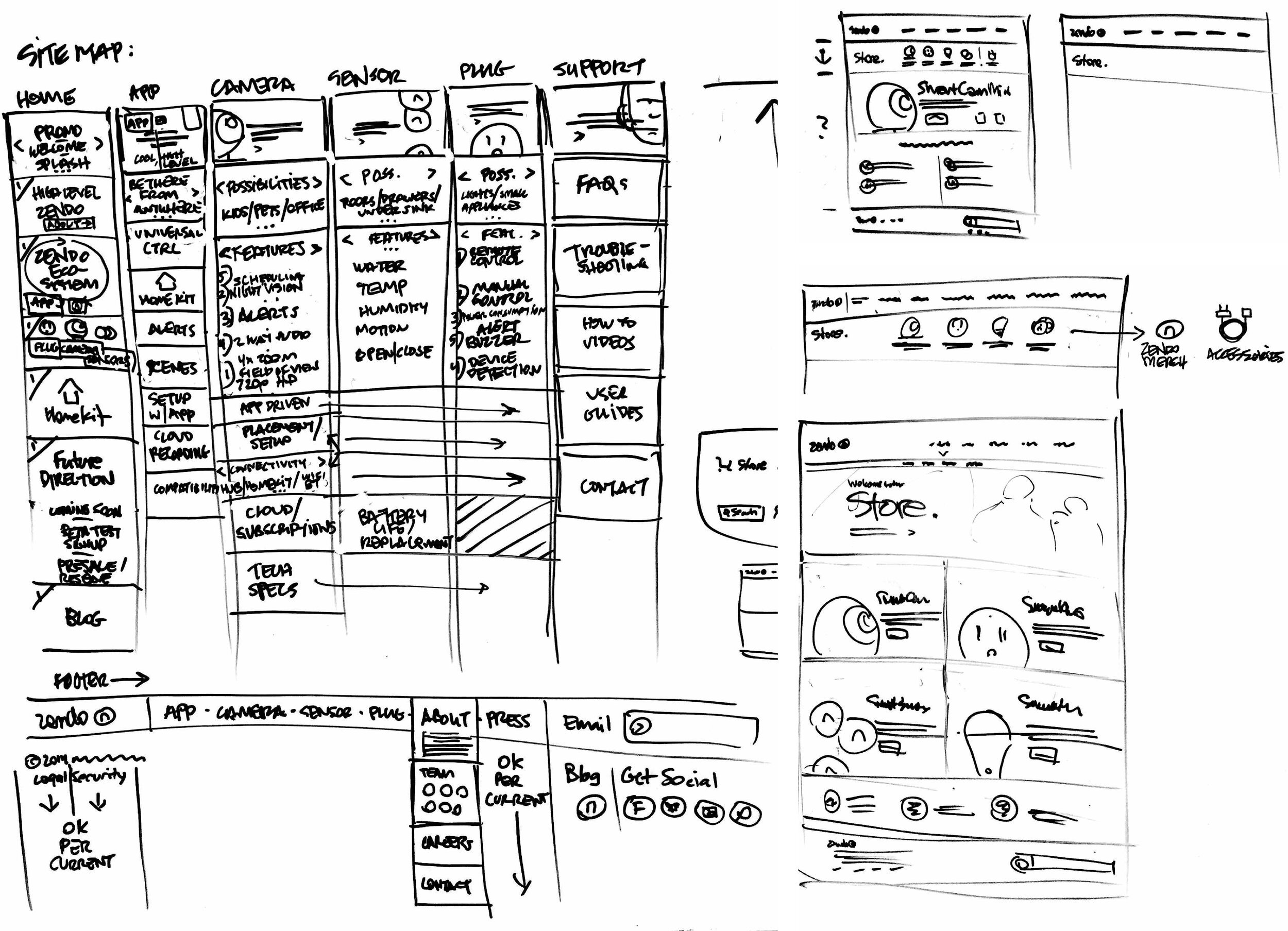


Research, site maps, and whiteboard sketches showing the flow and rounds of edits.


Credits: Darren Hoffman for leadership & direction, Rachel Leake for packaging design & retouching, Lauren Mantuo for marketing & strategy, & Iván Corchado Ruiz for UI development.